Cover of the Week: Go Away Death by John Creasy
Unfortunately, the specific graphic designer or illustrator for Arrow’s 1967 edition of Go Away Death is uncredited—a frustratingly common reality for British paperback publishing of that decade.
During the mid-to-late 1960s, Arrow Books (much like Pan, Corgi, and Fontana) operated an in-house art department where staff designers, layout artists, and typographers churned out dozens of covers a month without signatures or interior credits. While high-profile freelance illustrators occasionally got a small nod on the copyright page, standard series branding design like this one was treated as anonymous commercial work
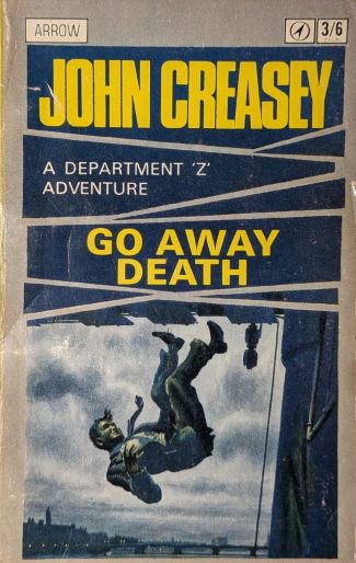
The 1967 Arrow Books paperback edition of John Creasey’s Go Away Death is a textbook example of British mid-century crime publishing trying to find its footing during a massive transition in cover art trends.
By 1967, Arrow (a paperback imprint of Hutchinson) was caught right in the middle of a shifting landscape: the traditional, painted pulp narratives of the 1950s were giving way to the stark, photographic, and highly stylized typographic designs pioneered by publishers like Penguin and Panther.
The late 1960s Arrow editions for Creasey (and his various pseudonyms) often relied on a hybrid approach. Instead of the fully painted, dynamic action scenes common in American pulps, Arrow frequently utilized minimalist, highly saturated graphic illustrations or stark photographic setups with bold, flat color overlays.
John Creasey’s name is set in an ultra-bold, high-impact sans-serif—often akin to Grotesque or Helvetica Extra Bold. It screams for attention, which makes sense because by 1967, Creasey was an absolute titan of the genre, churning out dozens of books a year. The author was the selling point.
The title Go Away Death is given secondary visual weight compared to Creasey’s name. It is clean and readable but lacks distinct character, relying entirely on the stark phrasing of the title itself to generate intrigue.
The slicing lines in the graphic design emphasize violence and action, while the stark tones of the falling man (and the grimace on his face) suggests the book will feature death and murder.
The transition from fully painted covers with minimal graphics to paperbacks with more stylized graphic design (like Go Away Death) is underappreciated. It is true that many crime series paperbacks are given a uniform style that does no emphasize the individual novel and more the series of books, I find this cover and others like it to be outstanding cover designs.
What is your take? Too generic or stand out design?
…
- Spywire has an interesting article on Creasy covers.
- Trasy Book Covers article at Murder, Mayhem, and Long Dogs